Welcome to Day 03 #The12DaysOfSwiftmas
Lets get started with today’s prompt:
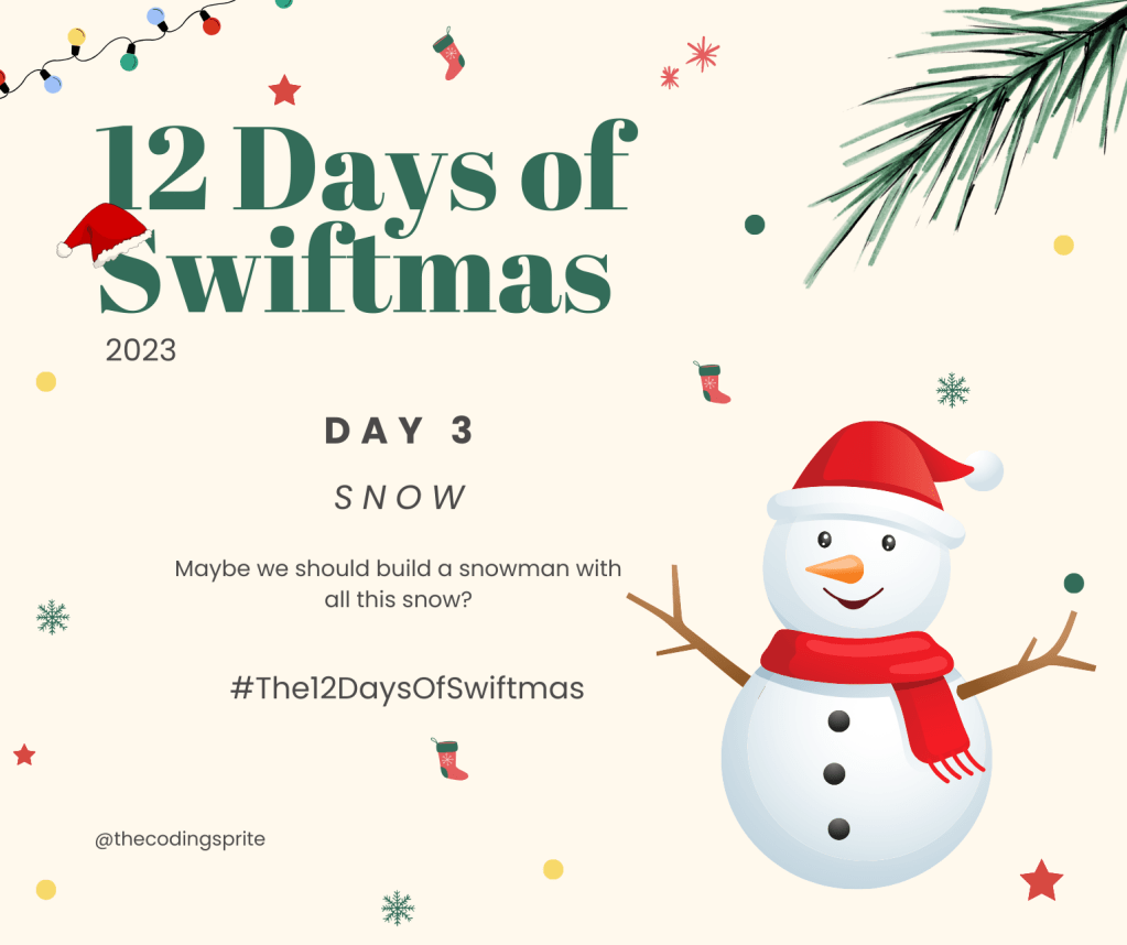
Now I gave a couple of hints away on today’s prompt. Of course snow can leave your imagination going wild & I can’t wait to see everyones ideas but for an easy go to app, why not build;d a snowman with me!

Now the theme of Frosty here is very much like yesterday’s prompt, with a little less confusion of layering a complex tree & using SwiftUI shapes in place of images wherever we can. A true programatic snowman if you will.
Don’t forget all the projects shown here are being uploaded to GitHub for you to clone & play with: https://github.com/thecodingsprite/Swiftmas-2023
So starting with a super basic snowman shape (apart from he arms that are images for ease). Using pretty much every shape available to us.
import SwiftUI

struct ContentView: View {
    var body: some View {
        ZStack {

            // TODO: Change background
            Color.blue
                .ignoresSafeArea()

            // Arms
            VStack {
                HStack {
                    Image("arm1")
                        .resizable()
                        .aspectRatio(contentMode: .fit)
                        .frame(width: 150)
                    Spacer()
                    Image("arm2")
                        .resizable()
                        .aspectRatio(contentMode: .fit)
                        .frame(width: 150)
                }
            }
            .padding(.bottom, 100)

            // Snowman
            VStack(spacing: 0) {

                // Top Hat
                Rectangle()
                    .foregroundStyle(.red)
                    .frame(width: 120, height: 60)
                    .padding(0)

                    RoundedRectangle(cornerRadius: 50)
                    .foregroundColor(.red)
                    .frame(width: 150, height: 5)
                    .zIndex(1.0)
                    .padding(.bottom, -10)

                ZStack {
                    // Head
                    Circle()
                        .foregroundStyle(.white)
                        .frame(width: 180)
                        .padding(.bottom, -30)
                    // Face features
                    VStack (spacing: 10){
                        // Eyes
                        HStack (spacing: 20) {
                            ZStack {
                                Circle()
                                    .foregroundStyle(.blue)
                                    .frame(width: 15)
                                Circle()
                                    .foregroundStyle(.black)
                                    .frame(width: 8)
                            }

                        }

                        // Nose


                        // Mouth

                    }

                }

                ZStack {
                    // Midrif
                    Circle()
                        .foregroundStyle(.white)
                        .frame(width: 220)
                        .padding(.bottom, -40)

                    // Buttons
                    VStack(spacing: 40) {
                        Circle()
                            .foregroundStyle(.black)
                            .frame(width: 20)
                        Circle()
                            .foregroundStyle(.black)
                            .frame(width: 20)
                    }
                    .padding(.top, 70)

                }
                ZStack {
                    // Body Base
                    Circle()
                        .foregroundStyle(.white)
                        .frame(width: 280)

                    // Buttons
                    VStack (alignment: .leading) {
                        Circle()
                            .foregroundStyle(.black)
                            .frame(width: 20)

                    }
                    .padding(.bottom, 195)

                }
            }

            // Scarf
            VStack {
                Spacer()
                // Scarf neck
                RoundedRectangle(cornerRadius: 10)
                    .foregroundStyle(.red)
                    .frame(width: 160, height: 20)
                    .padding(.top, 20)
                Spacer()
                Spacer()
            }

            VStack {
                Spacer()
                // Scarf dangle
                RoundedRectangle(cornerRadius:2)
                    .foregroundStyle(.red)
                    .frame(width: 20, height: 150)
                    .padding(.bottom, 50)
                    .padding(.trailing, 80)

                Spacer()
            }
        }

    }
}
Now I know you’re wondering about the nose & mouth…well I made the shapes for those in separate structures below the contentView & separated them here so you can concentrate on them as shapes aren’t to everyones liking.
// MARK: - Nose Shape
struct Nose: Shape {

    func path(in rect: CGRect) -> Path {

        var path = Path()

        path.move(to: CGPoint(x: rect.midX, y: rect.minY))
        path.addLine(to: CGPoint(x: rect.minX, y: rect.maxY))
        path.addLine(to: CGPoint(x: rect.maxX, y: rect.maxY))
        path.addLine(to: CGPoint(x: rect.midX, y: rect.minY))

        return path
    }
}

// MARK: - Mouth Shape

struct Mouth: Shape {
    var startAngle: Angle
    var endAngle: Angle
    var clockwise: Bool

    func path(in rect: CGRect) -> Path {

           var path = Path()

           path.addArc(center: CGPoint(x: rect.midX, y: rect.midY), radius: rect.width / 2, startAngle: startAngle, endAngle: endAngle, clockwise: clockwise)

           return path
       }
}
Now we can call these shapes where the comment for them sits & add modifiers to get them just in the right place.
// Nose
Nose()
  .foregroundStyle(.orange)
  .frame(width: 20, height: 40)
  .rotationEffect(Angle(degrees: 180))

// Mouth
Mouth(startAngle: .degrees(0), endAngle: .degrees(180), clockwise: false)
  .stroke(.black, lineWidth: 5)
  .frame(width: 30, height: 5)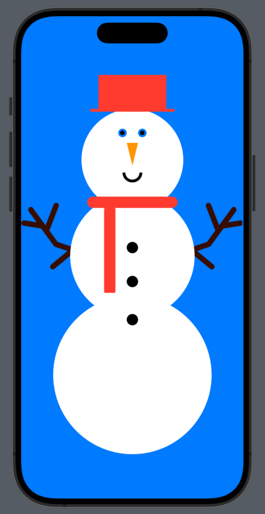
Your preview should be looking something rather eye popping like this.
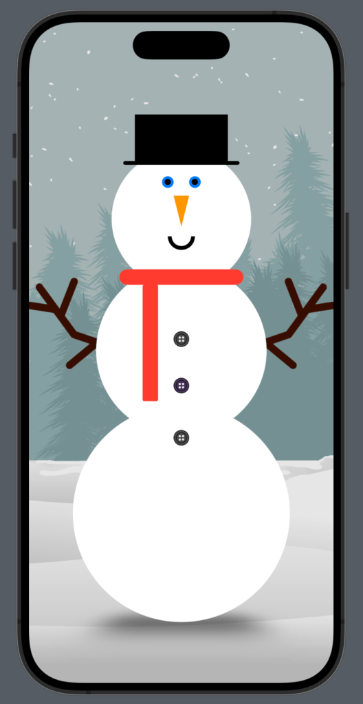
Next it was time to begin refining things down. I added some more image assets for the buttons (I mean buttons need to look like buttons right?!) as well as a background image. I also moved the Top Hat position. This gave me greater control in the end. I then decided he might look better with a base shadow, so added this too & finally added some extra space between the arms. I have collapsed the un-tampered code for easier reading.
struct ContentView: View {
    var body: some View {
        ZStack {

            // Background
            Image("bg")
                .resizable()
                .aspectRatio(contentMode: .fill)
                .ignoresSafeArea()
            // Darken bg
            Color.black
                .opacity(0.1)
                .ignoresSafeArea()

            // Snowman shadow
            VStack {
                Spacer()

                RoundedRectangle(cornerRadius: 80)
                    .frame(width: 200, height: 35)
                    .blur(radius: 20)
                    .rotation3DEffect(.degrees(60),axis: (1,0,0))
                    .padding(.bottom, 25)
                    .opacity(0.7)
            }


            // Arms
            VStack {
                HStack (spacing: 100) {
                    Image("arm1")
                        .resizable()
                        .aspectRatio(contentMode: .fit)
                        .frame(width: 150)

                    Image("arm2")
                        .resizable()
                        .aspectRatio(contentMode: .fit)
                        .frame(width: 150)
                }
            }
            .padding(.bottom, 100)

            // Snowman
            VStack(spacing: 0) {

                ZStack {...}

                ZStack {
                    // Midrif
                    Circle()
                        .foregroundStyle(.white)
                        .frame(width: 220)
                        .padding(.bottom, -40)

                    // Buttons
                    VStack(spacing: 40) {
                        Image("button2")
                            .resizable()
                            .aspectRatio(contentMode: .fit)
                            .frame(width: 20)

                        Image("button1")
                            .resizable()
                            .aspectRatio(contentMode: .fit)
                            .frame(width: 20)
                    }
                    .padding(.top, 70)

                }
                ZStack {
                    // Body Base
                    Circle()
                        .foregroundStyle(.white)
                        .frame(width: 280)

                    // Buttons
                    VStack (alignment: .leading) {
                        Image("button2")
                            .resizable()
                            .aspectRatio(contentMode: .fit)
                            .frame(width: 20)

                    }
                    .padding(.bottom, 195)

                }
            } .padding(.top, 60)

            // Top Hat
            VStack (spacing: 0) {
                Rectangle()
                    .foregroundStyle(.black)
                    .frame(width: 120, height: 60)
                    .padding(0)

                RoundedRectangle(cornerRadius: 50)
                    .foregroundColor(.black)
                    .frame(width: 150, height: 5)

                Spacer()
            }
            .padding(.top, 60)


            // Scarf
            VStack {...}

            VStack {...}
        }
    }
}
Now we are getting somewhere!
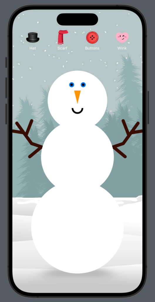
For the design part, I was happy with Mr Frosty here, but for a user there was zero interaction. So let’s add some buttons for a user to dress/undress the snowman. We always begin with adding those @State properties.
@State var isHat = false
@State var isScarf = false
@State var isButtons = false
@State var isWinking = false
Yes you read this correctly. I thought it might be fun to get the snowman to wink. So let’s now modify the code to get this working. We will start by adding those buttons.
// Buttons
            VStack {
                HStack (spacing: 40) {
                    Button {
                        isHat.toggle()
                    } label: {
                        VStack(spacing: 0) {
                            Image("hat")
                                .resizable()
                                .aspectRatio(contentMode: .fit)
                                .frame(width: 50)

                            Text("Hat")
                                .font(.caption)
                                .foregroundStyle(.white)
                        }
                    }

                    Button {
                        isScarf.toggle()
                    } label: {
                        VStack(spacing: 0) {
                            Image("scarf")
                                .resizable()
                                .aspectRatio(contentMode: .fit)
                                .frame(width: 50)

                            Text("Scarf")
                                .font(.caption)
                                .foregroundStyle(.white)
                        }
                    }

                    Button {
                        isButtons.toggle()
                    } label: {
                        VStack(spacing: 0) {
                            Image("button-icon")
                                .resizable()
                                .aspectRatio(contentMode: .fit)
                                .frame(width: 50)

                            Text("Buttons")
                                .font(.caption)
                                .foregroundStyle(.white)
                        }
                    }
                    Button {
                        isWinking.toggle()
                    } label: {
                        VStack(spacing: 0) {
                            Image("wink")
                                .resizable()
                                .aspectRatio(contentMode: .fit)
                                .frame(width: 50)

                            Text("Wink")
                                .font(.caption)
                                .foregroundStyle(.white)
                        }
                    }
                }
                Spacer()
            }
            .padding(.horizontal)
Feel free to add an extension like yesterday to replace the repeated image modifiers. I do this later on. Now onto re-formatting the snowman code to change when the @State changes.
Starting with the winking eye:
// Eyes
HStack (spacing: 20) {

   if isWinking {
          // L eye
          ZStack {
             Circle()
                .foregroundStyle(.blue)
                .frame(width: 15)
             Circle()
                .foregroundStyle(.black)
                .frame(width: 8)
          }

           // R eye
           RoundedRectangle(cornerRadius: 10)
               .foregroundStyle(.black)
               .frame(width: 15, height: 5)
               .padding(.vertical, 5)

        } else {

           // L eye
           ZStack {
               Circle()
                   .foregroundStyle(.blue)
                   .frame(width: 15)
               Circle()
                   .foregroundStyle(.black)
                   .frame(width: 8)
            }
            // R eye
            ZStack {
                Circle()
                   .foregroundStyle(.blue)
                   .frame(width: 15)
                 Circle()
                   .foregroundStyle(.black)
                   .frame(width: 8)
             }
          }
Now the buttons. I added an if statement to both places of the buttons.
ZStack {
                    // Midrif
                    Circle()
                        .foregroundStyle(.white)
                        .frame(width: 220)
                        .padding(.bottom, -40)

                    // Buttons
                    if isButtons {
                        VStack(spacing: 40) {
                            Image("button2")
                                .resizable()
                                .aspectRatio(contentMode: .fit)
                                .frame(width: 20)

                            Image("button1")
                                .resizable()
                                .aspectRatio(contentMode: .fit)
                                .frame(width: 20)
                        }
                        .padding(.top, 70)
                    }

                }
                ZStack {
                    // Body Base
                    Circle()
                        .foregroundStyle(.white)
                        .frame(width: 280)

                    // Buttons
                    if isButtons {
                        VStack (alignment: .leading) {
                            Image("button2")
                                .resizable()
                                .aspectRatio(contentMode: .fit)
                                .frame(width: 20)

                        }
                        .padding(.bottom, 195)
                    }

                }
            } .padding(.top, 100)
Top hat & scarf were easily just wrapped in respective if statements like so:
// Top Hat
            if isHat {
                VStack (spacing: 0) {
                    Rectangle()
                        .foregroundStyle(.black)
                        .frame(width: 120, height: 60)
                        .padding(0)

                    RoundedRectangle(cornerRadius: 50)
                        .foregroundColor(.black)
                        .frame(width: 150, height: 5)

                    Spacer()
                }
                .padding(.top, 80)
            }
// Scarf
            if isScarf {
                VStack {
                    Spacer()
                    // Scarf neck
                    RoundedRectangle(cornerRadius: 10)
                        .foregroundStyle(.red)
                        .frame(width: 160, height: 20)
                        .padding(.top, 45)
                    Spacer()
                    Spacer()
                }


                VStack {
                    Spacer()
                    // Scarf dangle
                    RoundedRectangle(cornerRadius:2)
                        .foregroundStyle(.red)
                        .frame(width: 20, height: 150)
                        .padding(.bottom, 50)
                        .padding(.trailing, 80)

                    Spacer()
                }
            }
After all this I added the background image to the .background() modifier instead. This allows me to use the aspect ratio of fill instead & just looked a lot nicer. This is attached to the 1st/base ZStack.
.background (
            Image("bg")
            .resizable()
            .aspectRatio(contentMode: .fill)
            .ignoresSafeArea()
I also decided to remove the darken overlay I had on the original background as it wasn’t needed.
For creating the custom modifiers for the buttons I used an extension of Image along with creating my own custom modifier struct for the text styling.
extension Image {
    func buttonImageStyle() -> some View {
        self
            .resizable()
            .aspectRatio(contentMode: .fit)
            .frame(width: 50)
    }
}

struct ButtonTextStyle: ViewModifier {
    func body(content: Content) -> some View {
        content
            .font(.caption)
            .foregroundStyle(.white)
    }
}
The complete functional code is at the bottom of this post.
Our Completed Snowman Building App
See you tomorrow for day 04.
Complete Code
import SwiftUI
struct ContentView: View {
@State var isHat = false
@State var isScarf = false
@State var isButtons = false
@State var isWinking = false
var body: some View {
ZStack {
// Buttons
VStack {
HStack (spacing: 40) {
Button {
isHat.toggle()
} label: {
VStack(spacing: 0) {
Image("hat")
.buttonImageStyle()
Text("Hat")
.modifier(ButtonTextStyle())
}
}
Button {
isScarf.toggle()
} label: {
VStack(spacing: 0) {
Image("scarf")
.buttonImageStyle()
Text("Scarf")
.modifier(ButtonTextStyle())
}
}
Button {
isButtons.toggle()
} label: {
VStack(spacing: 0) {
Image("button-icon")
.buttonImageStyle()
Text("Buttons")
.modifier(ButtonTextStyle())
}
}
Button {
isWinking.toggle()
} label: {
VStack(spacing: 0) {
Image("wink")
.buttonImageStyle()
Text("Wink")
.modifier(ButtonTextStyle())
}
}
}
Spacer()
}
.padding(.horizontal)
// Snowman shadow
VStack {
Spacer()
RoundedRectangle(cornerRadius: 80)
.frame(width: 200, height: 35)
.blur(radius: 20)
.rotation3DEffect(.degrees(60),axis: (1,0,0))
.padding(.bottom, 10)
.opacity(0.3)
}
// Arms
VStack {
HStack (spacing: 100) {
Image("arm1")
.resizable()
.aspectRatio(contentMode: .fit)
.frame(width: 150)
Image("arm2")
.resizable()
.aspectRatio(contentMode: .fit)
.frame(width: 150)
}
}
.padding(.bottom, 100)
// Snowman
VStack(spacing: 0) {
ZStack {
// Head
Circle()
.foregroundStyle(.white)
.frame(width: 180)
.padding(.bottom, -30)
// Face features
VStack (spacing: 10){
// Eyes
HStack (spacing: 20) {
if isWinking {
// L eye
ZStack {
Circle()
.foregroundStyle(.blue)
.frame(width: 15)
Circle()
.foregroundStyle(.black)
.frame(width: 8)
}
// R eye
RoundedRectangle(cornerRadius: 10)
.foregroundStyle(.black)
.frame(width: 15, height: 5)
.padding(.vertical, 5)
} else {
// L eye
ZStack {
Circle()
.foregroundStyle(.blue)
.frame(width: 15)
Circle()
.foregroundStyle(.black)
.frame(width: 8)
}
// R eye
ZStack {
Circle()
.foregroundStyle(.blue)
.frame(width: 15)
Circle()
.foregroundStyle(.black)
.frame(width: 8)
}
}
}
// Nose
Nose()
.foregroundStyle(.orange)
.frame(width: 20, height: 40)
.rotationEffect(Angle(degrees: 180))
// Mouth
Mouth(startAngle: .degrees(0), endAngle: .degrees(180), clockwise: false)
.stroke(.black, lineWidth: 5)
.frame(width: 30, height: 5)
}
}
ZStack {
// Midrif
Circle()
.foregroundStyle(.white)
.frame(width: 220)
.padding(.bottom, -40)
// Buttons
if isButtons {
VStack(spacing: 40) {
Image("button2")
.resizable()
.aspectRatio(contentMode: .fit)
.frame(width: 20)
Image("button1")
.resizable()
.aspectRatio(contentMode: .fit)
.frame(width: 20)
}
.padding(.top, 70)
}
}
ZStack {
// Body Base
Circle()
.foregroundStyle(.white)
.frame(width: 280)
// Buttons
if isButtons {
VStack (alignment: .leading) {
Image("button2")
.resizable()
.aspectRatio(contentMode: .fit)
.frame(width: 20)
}
.padding(.bottom, 195)
}
}
} .padding(.top, 100)
// Top Hat
if isHat {
VStack (spacing: 0) {
Rectangle()
.foregroundStyle(.black)
.frame(width: 120, height: 60)
.padding(0)
RoundedRectangle(cornerRadius: 50)
.foregroundColor(.black)
.frame(width: 150, height: 5)
Spacer()
}
.padding(.top, 80)
}
// Scarf
if isScarf {
VStack {
Spacer()
// Scarf neck
RoundedRectangle(cornerRadius: 10)
.foregroundStyle(.red)
.frame(width: 160, height: 20)
.padding(.top, 45)
Spacer()
Spacer()
}
VStack {
Spacer()
// Scarf dangle
RoundedRectangle(cornerRadius:2)
.foregroundStyle(.red)
.frame(width: 20, height: 150)
.padding(.bottom, 50)
.padding(.trailing, 80)
Spacer()
}
}
}
.background (
Image("bg")
.resizable()
.aspectRatio(contentMode: .fill)
.ignoresSafeArea()
)
}
}
// MARK: - Nose Shape
struct Nose: Shape {
func path(in rect: CGRect) -> Path {
var path = Path()
path.move(to: CGPoint(x: rect.midX, y: rect.minY))
path.addLine(to: CGPoint(x: rect.minX, y: rect.maxY))
path.addLine(to: CGPoint(x: rect.maxX, y: rect.maxY))
path.addLine(to: CGPoint(x: rect.midX, y: rect.minY))
return path
}
}
// MARK: - Mouth Shape
struct Mouth: Shape {
var startAngle: Angle
var endAngle: Angle
var clockwise: Bool
func path(in rect: CGRect) -> Path {
var path = Path()
path.addArc(center: CGPoint(x: rect.midX, y: rect.midY), radius: rect.width / 2, startAngle: startAngle, endAngle: endAngle, clockwise: clockwise)
return path
}
}
extension Image {
func buttonImageStyle() -> some View {
self
.resizable()
.aspectRatio(contentMode: .fit)
.frame(width: 50)
}
}
struct ButtonTextStyle: ViewModifier {
func body(content: Content) -> some View {
content
.font(.caption)
.foregroundStyle(.white)
}
}
