
Is it snowing where you are? What kind of app do you fancy creating today?

For the Sixth prompt, we have Snowflake. What will you create?
I’m looking forward to seeing what you come up with today.
Designing snowflakes has never been more fun! This Snowflake Design App lets users choose a snowflake template, customize it with colors and brush strokes, and draw their unique designs. In this tutorial, we’ll walk you through building the app step-by-step. Purposely I have left some features for you to have fun adding yourself.
What We’ll Build
- A Template Picker View to select a snowflake base.
- A Designer View to annotate and customize the snowflake.
- Features for selecting brush colors, adjusting stroke widths, and more.
Getting Started
1. Set Up Your Project
You can find the sample project in the GitHub repository here
Create a new SwiftUI project in Xcode:
- Open Xcode and select Create a new project.
- Choose the App template, click Next.
- Enter your project name (e.g., SnowflakeDesigner”), set the interface to SwiftUI, and click Create.
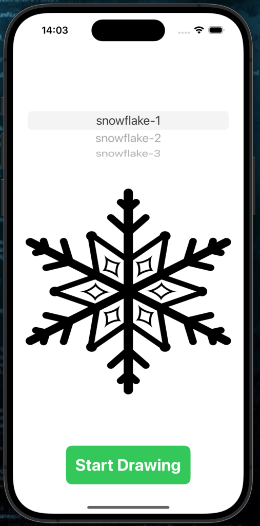
Step 1: Template Picker View
The SnowflakeTemplatePickerView allows users to select a snowflake template from a list. Once selected, they can proceed to the designer screen. Rename your “ContentView” to SnowflakeTemplatePickerView
Here are the image assets I have used for the templates. Snowflake-1, Snowflake-2, Snowflake-3
Code for Template Picker View
import SwiftUI

struct SnowflakeTemplatePickerView: View {
    let templates: [String] = ["snowflake-1", "snowflake-2", "snowflake-3"] // Image names
    @State private var selectedTemplate = "snowflake-1" // Default template

    var body: some View {
        NavigationView {
            VStack {
                // Template Picker
                Picker("Choose Template", selection: $selectedTemplate) {
                    ForEach(templates, id: \.self) { template in
                        Text(template).tag(template)
                    }
                }
                .pickerStyle(WheelPickerStyle())
                .padding()

                // Display Selected Template
                Image(selectedTemplate)
                    .resizable()
                    .frame(width: 300, height: 300)

                Spacer()

                // Navigate to Designer View
                NavigationLink(destination: SnowflakeDesignerView(snowflakeImage: Image(selectedTemplate))) {
                    Text("Start Drawing")
                        .font(.title)
                        .fontWeight(.bold)
                        .padding()
                        .foregroundColor(.white)
                        .background(Color.green)
                        .cornerRadius(10)
                }
                .padding()
                .buttonStyle(PlainButtonStyle())
            }
            .navigationTitle("Choose Snowflake Template")
            .navigationBarTitleDisplayMode(.inline)
        }
    }
}
Features of the Template Picker:
- Dynamic Picker: Displays available templates in a wheel-style picker.
- Template Preview: Updates dynamically to show the selected snowflake.
- Navigation: A
NavigationLinktakes the user to the designer view, passing the selected template.
Start by adding the variables to store the image assets & the default asset/picker variable. We then add a picker. I chose to display the image the user selected as it’s just nicer. Finally we add navigation link to a view that we haven’t set up yet, but just know that is next.
Step 2: Snowflake Designer View
The SnowflakeDesignerView is where the magic happens. Users can draw on the selected snowflake template, choose brush colors, and adjust stroke width. Add a new file from template (view) and name it SnowflakeDesignerView.
Code for Designer View
import SwiftUI

struct SnowflakeDesignerView: View {
    let snowflakeImage: Image // The selected snowflake template

    @State private var drawing: [Path] = [] // Stores completed paths
    @State private var currentPath = Path() // Path being actively drawn
    @State private var currentColor: Color = .blue // Default brush color
    @State private var strokeWidth: CGFloat = 2 // Default stroke width

    let colors: [Color] = [.white, .red, .green, .yellow, .purple] // Predefined color palette

    var body: some View {
        VStack {
            // Color Picker
            HStack {
                ForEach(colors, id: \.self) { color in
                    Circle()
                        .fill(color)
                        .frame(width: 40, height: 40)
                        .onTapGesture {
                            currentColor = color
                        }
                        .padding(4)
                }
            }
            .padding()

            // Stroke Width Slider
            VStack {
                Text("Stroke Width: \(Int(strokeWidth))")
                    .padding()
                    .foregroundStyle(.white)
                Slider(value: $strokeWidth, in: 1...10, step: 1)
                    .padding([.leading, .trailing])
            }

            // Drawing Area
            ZStack {
                snowflakeImage
                    .resizable()
                    .scaledToFit()
                    .frame(width: 300, height: 300)
                    .opacity(0.5) // Semi-transparent for tracing

                Canvas { context, size in
                    // Draw Current Path
                    context.stroke(currentPath, with: .color(currentColor), lineWidth: strokeWidth)

                    // Draw Completed Paths
                    for path in drawing {
                        context.stroke(path, with: .color(currentColor), lineWidth: strokeWidth)
                    }
                }
                .gesture(
                    DragGesture(minimumDistance: 0)
                        .onChanged { value in
                            currentPath.addLine(to: value.location)
                        }
                        .onEnded { _ in
                            drawing.append(currentPath)
                            currentPath = Path() // Reset for next drawing
                        }
                )
            }
            .padding()
        }
        .background(Color.black)
    }
}
Features of the Designer View:
- Interactive Drawing:
- Users can draw freehand over the snowflake template.
- The current drawing updates in real time.
- Color Selection:
- A palette of predefined colors lets users customize their designs.
- Adjustable Brush Size:
- A slider allows users to set the stroke width for precision drawing.
Again we start with adding our @State variables before adding the option for the user to select colours. This could be done a few different ways, but I chose a selected few stored in the colors array.
Users need at least a stroke width option. So a simple slider would do in this case. It could be improved, but trying to keep things simple in a more advanced application means some trade offs. Next we create the drawing canvas using gestures from the user to draw. I chose a black background so the user could paint a white snowflake. You can change this to whatever you wish.
You will need to include the image call in the preview if so using:
#Preview {
    SnowflakeDesignerView(snowflakeImage: Image("snowflake-1"))
}
Step 3: Connecting the Views
The two views work together:
- SnowflakeTemplatePickerView: Selects the template and passes it to the designer view.
- SnowflakeDesignerView: Displays the selected template and provides tools for annotation.
Run the app and test the workflow:
- Draw, customize, and create your unique snowflake design.
- Choose a snowflake template from the picker.
- Navigate to the designer screen.
What’s Next?
Take your Snowflake Design App to the next level with these enhancements:
- Save and Share Designs:
- Let users save their custom snowflakes as images.
- Use a share sheet to export designs via email or social media.
- Add Pre-Designed Elements:
- Provide drag-and-drop pre-designed elements like stars or smaller snowflakes.
- Undo/Redo Functionality:
- Allow users to undo their last stroke or redo a previously undone action.
- Collaborative Design:
- Enable multi-user collaboration, where multiple users can work on the same snowflake design in real time.
- Animation:
- Animate the final snowflake design to spin or fall like real snowflakes.
- Brushes:
- Allow the user to select different stroke styles
🎉 Congratulations! You’ve built a fully functional Snowflake Design App in SwiftUI. Experiment with enhancements, and have fun customizing your snowflakes. This was a more advanced application, but one that will be great fun to experiment with. Happy coding and see you tomorrow! ☃️
